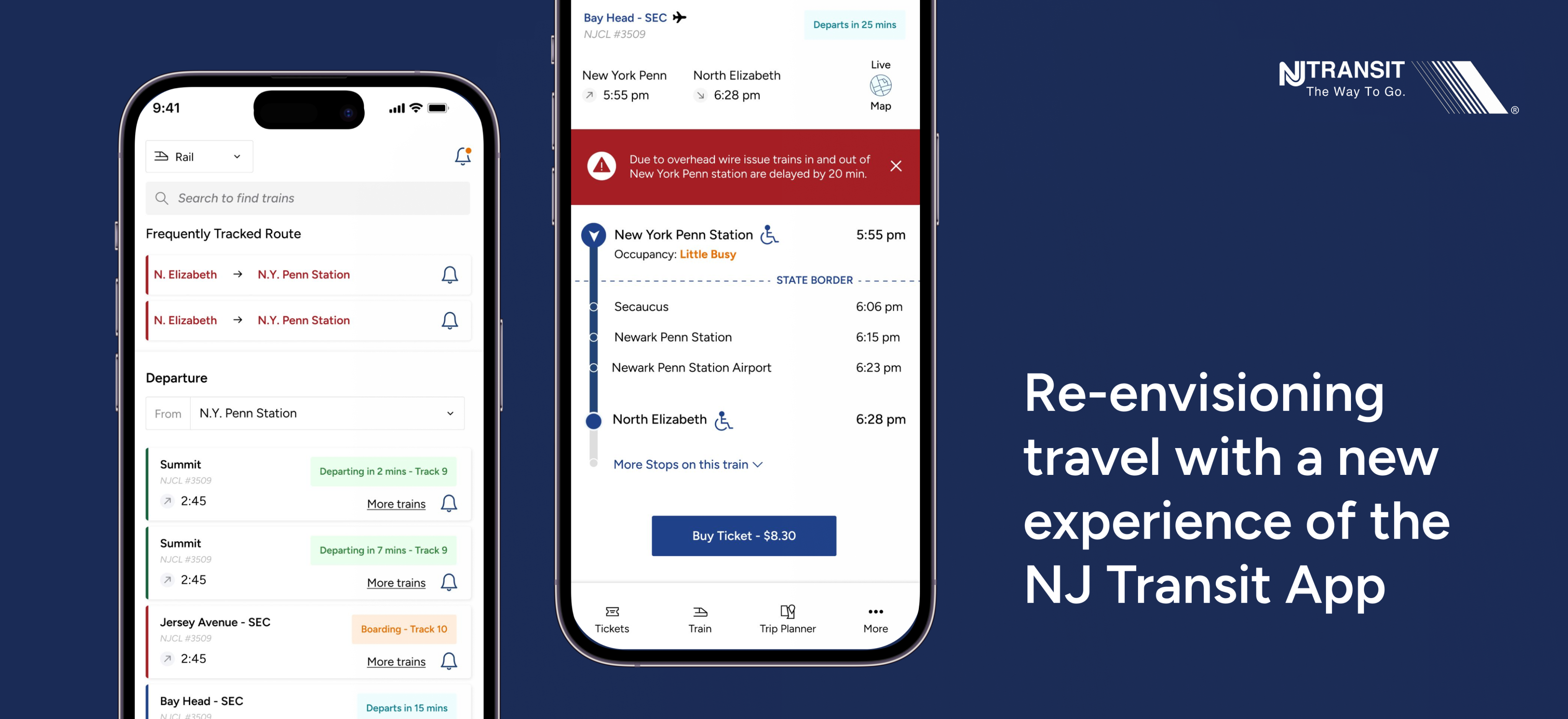
Trying to create a more minimalistic design to create a much more detailed & user centered app.
ROLE: UX Designer / User Interaction Designer
DURATION: 8 weeks
Introduction
Since 2013, Nj Transit app aims to provide train tracking, trip planning & mobile ticketing services. The app facilitates about 270 million passenger trips annually, across Railways, Bus & Light Rail services.
Challenge
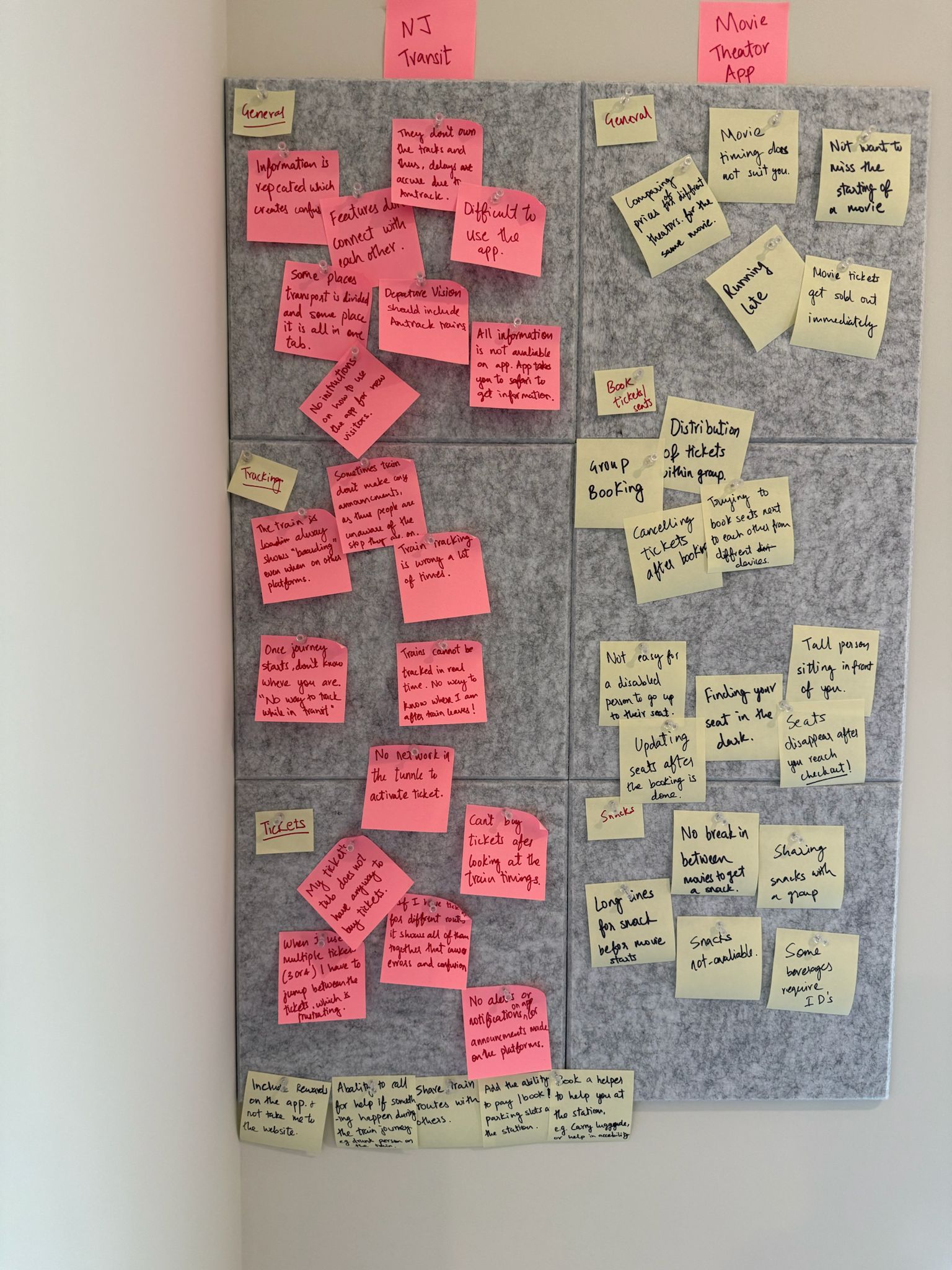
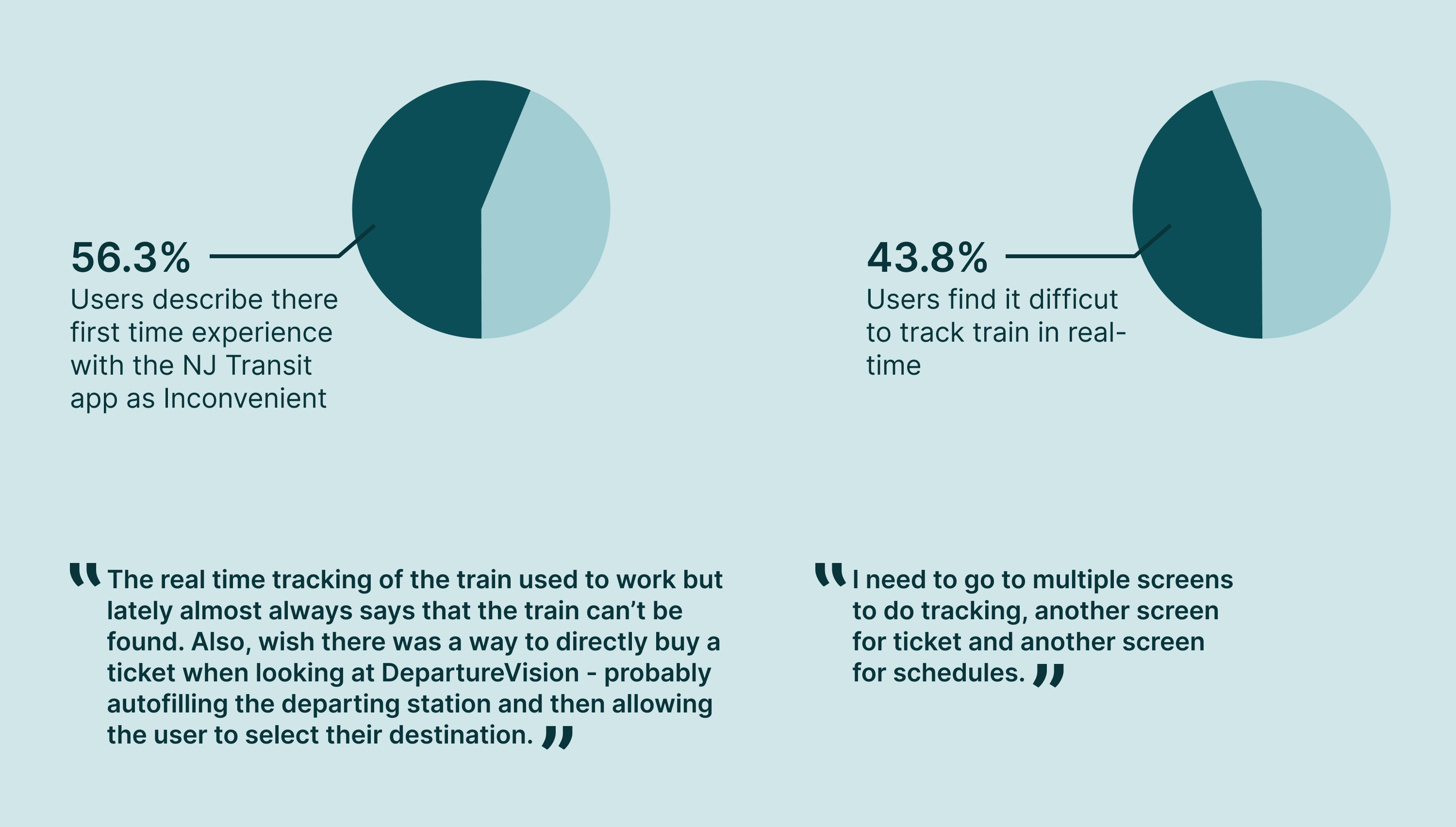
Real time tracking is not always accurate, and the app lacks providing real-time updates. For a new user the app is confusing and multiple attempts need to be made to reach where they they want to go on the app.
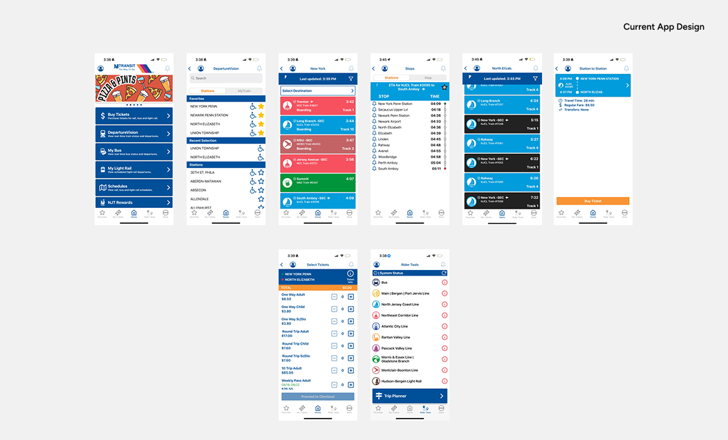
Current App Design
Insights
Initial Research
After analysis the app and documenting the initial problems on the app, I created a survey and the results helped me to dig deeper and get users reviews on the app and it’s functionality. The survey helped me understand problems that the NJ Transit app has.
The initial reserach & user insights This also helped me to identify user groups.
Using insights from the survey I created an empathy map to better understand the user & there responses.
The results were a bit diffrent than what I expected. Some users have been using the app on a daily basis and use a few features like ticket purchase, ticket activation & tracking train departure timings. They are comfortable with these features and use only that but don’t explore many other features that the app already has. The app is complicated and thus feature discovery is less. On the other hand, new users or users who don’t use the app on a daily basis find it extremely frustrating to use the app, especially when they are in a hurry. The user experience seems broken and getting from one screen to another to complete the process is complex and takes multiple try's.
Currently, the entire user experience lacks recall value and lacks Call to action button in the most critical places, all this combined adds a lot of cogitative load.
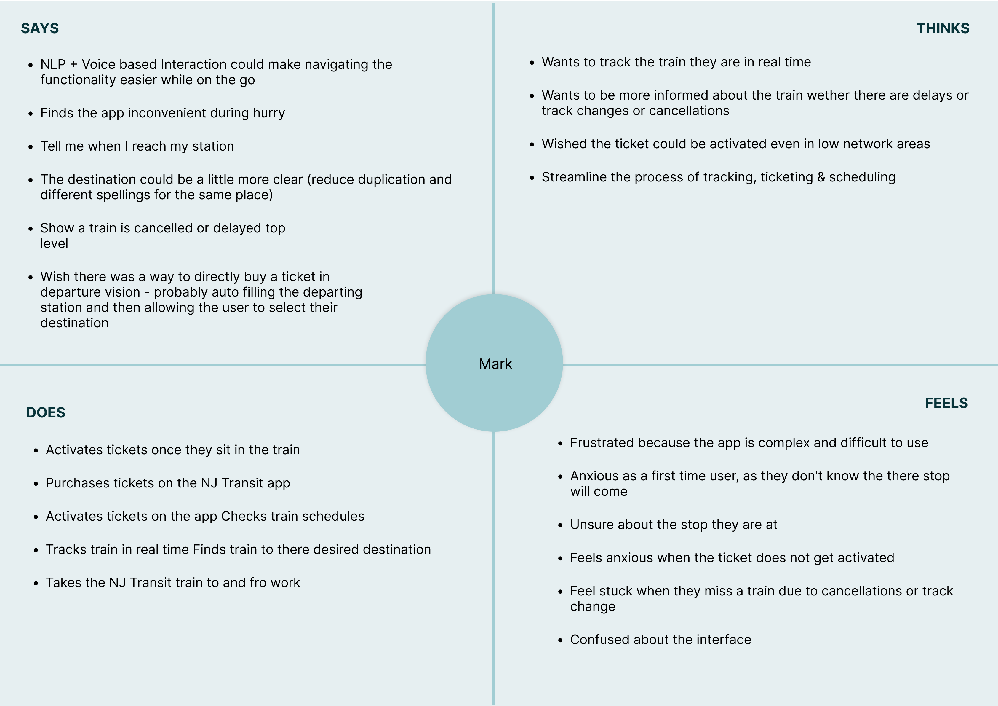
From all the research and insights, I created an aggregated empathy map for the general user of the app. This exercise helped me put all information I had collected into a structure and this helped me understand the user and there problems better. Using this information I went ahead and created User Personas.
User Personas
With all the research, I identified 2 user groups or types of users. They both have different needs and expectations from the app. Both these user group were identified by the common patterns that came from what the users answered during the survey.
- Everyday commuters want a seamless tracking trains in realtime and ticket purchasing experience that is robust. Along with this users wants to receive notification regarding any update or delays on his route. He also wants the ability to activate his ticket in low network areas so he can travel in peace and not stress about ticket not getting activated once in the train.
- New Commuters wants the ability to plan his trip end -to - end with the help of the app. He is new to the area and thus wants to receive notification closer to reaching his stop. He would like to be able to search for trains, track his train and purchase ticket for his train in a hassle free and easy way.
Both the types of users have diffrent needs and expectations from the app, but the main goal for both the users is the same i.e. have a hassle free easy commute.
To expand on my understanding of the personas and deepen my understanding of the user groups I created user stories. These stories help me narrow down on what the priorities are in terms of design goals.
- As an everyday traveler, I want to receive real-time notifications about train delays and track changes, so that I can adjust my schedule without constantly checking the app.
- As a new resident, I want a real-time train tracking feature that shows my current location and upcoming stops, so that I never miss my station.
- As a first time app user, I want a simplified navigation of the app, so that I can quickly learn how to use the app without any confusion.
- As a daily commuter, I want quick access to train schedules, ticket activation, and real-time tracking on a single screen, so that I don’t have to go through multiple menus for essential tasks.
- As a first time user, I want to find the best route possible to my destination, so that I can save on travel time.
- As a new resident, I want to know which station stop is closest to my destination, so that I can travel hassle free and save time.
Further I created user journeys for the personas created earlier. With these journey maps I discovered gaps in the existing journey.
Goals of the Re-design
Once the user peronas
- Our NJ Transit app will let users have a seamless app experience for scheduling travel, purchasing tickets & receiving vital alerts (e.g. Delays, Upcoming stops) which will affect how the user travels to work by providing a hassle-free and efficient way to commute.
We will measure effectiveness by the increase in the number of first time users.
User Flows & Low - Fidelity Wireframe
I created user flow for the new layout.
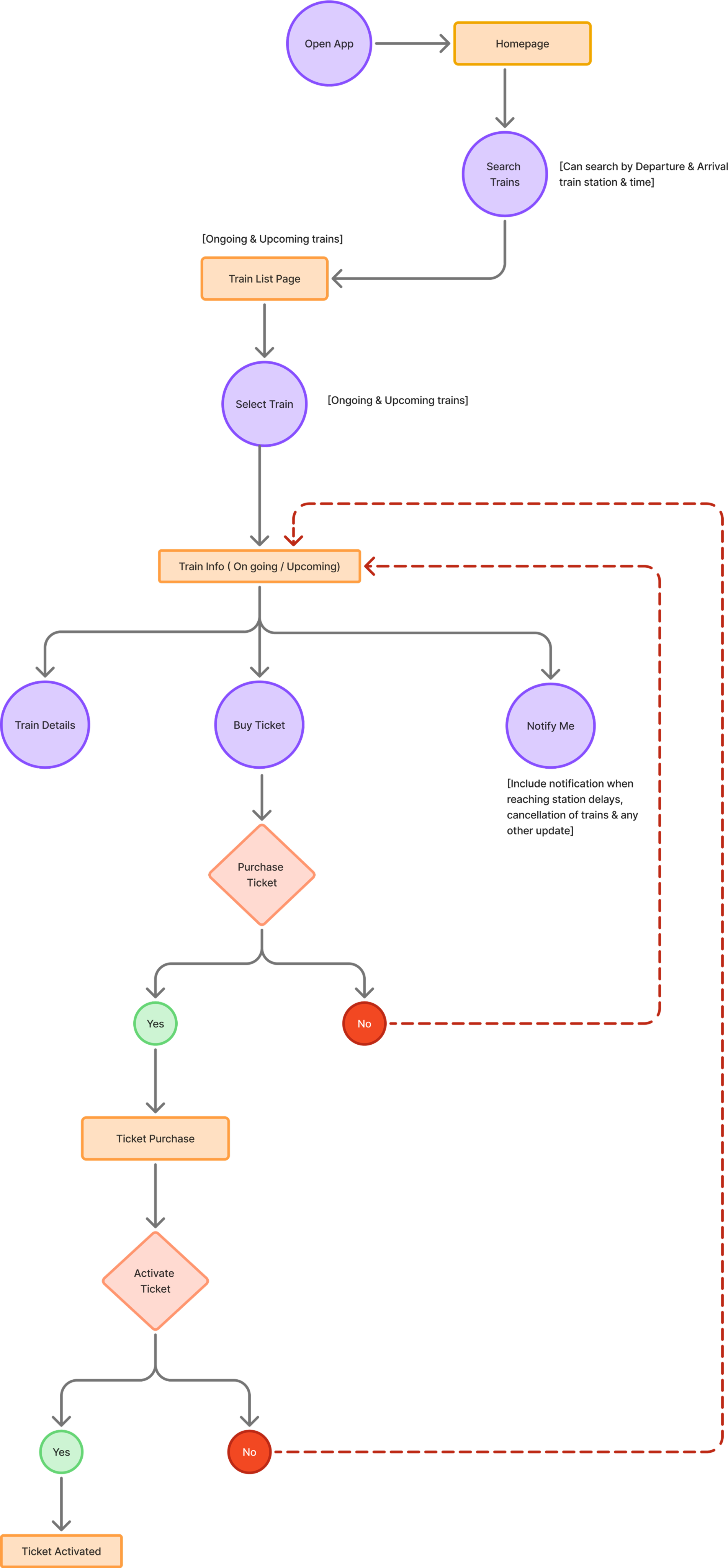
Search Train Flow
Train Routes Flow
Wireframes
According to the User flow I created sketches & wireframes. After multiple alterations and testing multiple ideas the final wireframes were created. These wireframes acted as a base before design the final screens for the app.
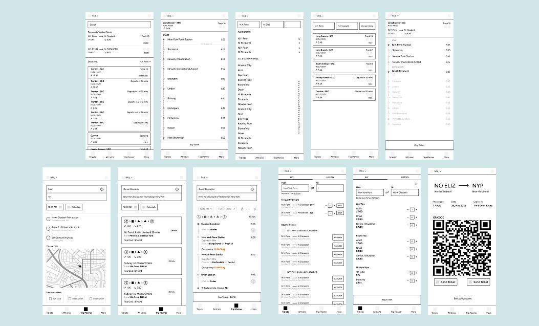
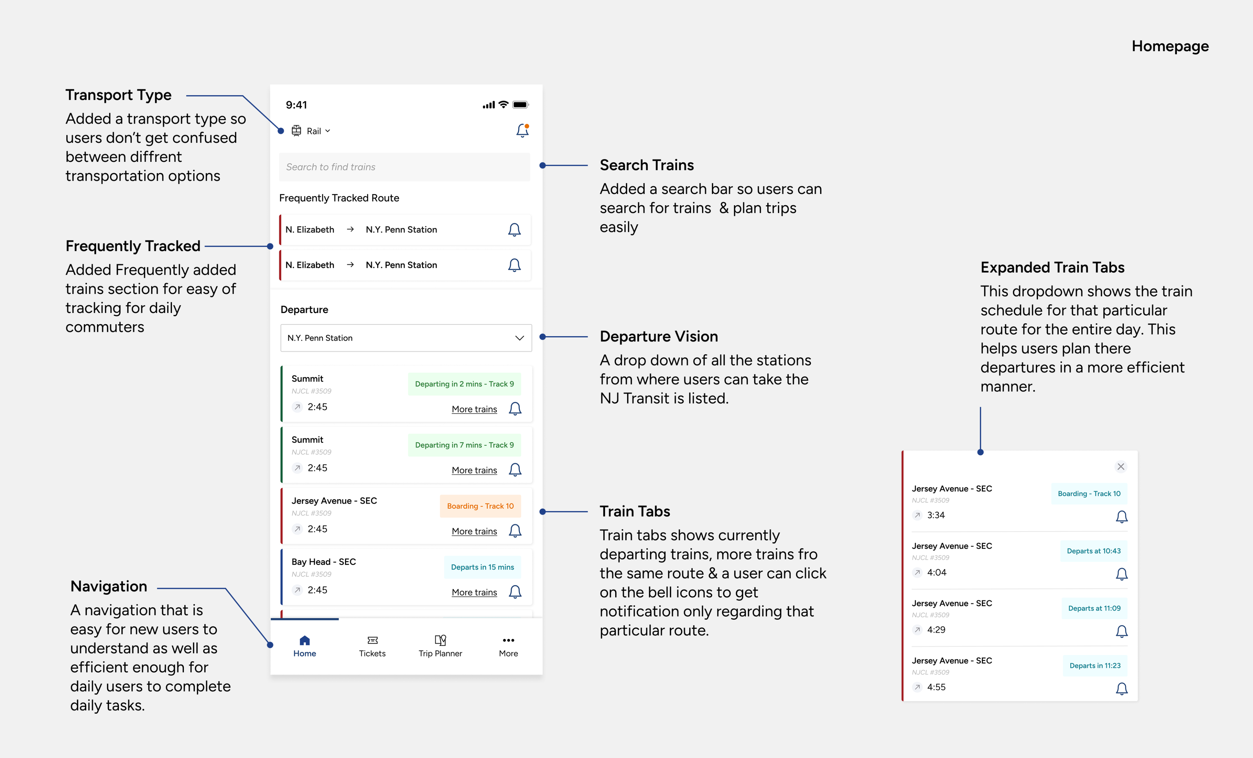
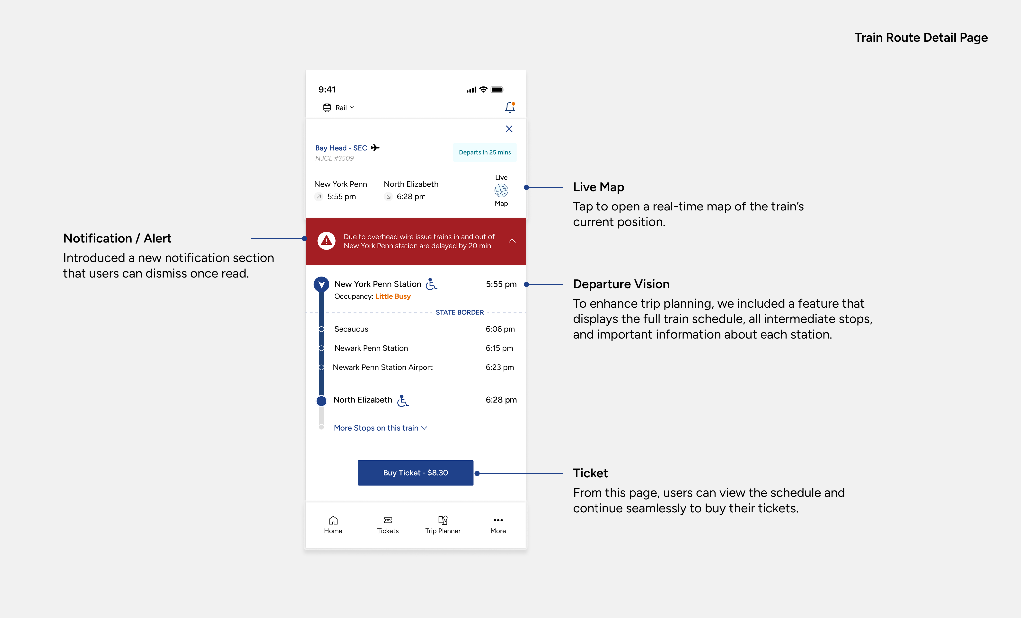
Final Wireframes
According to the User flow I created sketches & wireframes. After multiple alterations and testing multiple ideas the final wireframes were created. These wireframes acted as a base before design the final screens for the app.
Trying to create a more minimalistic design to create a much more detailed & user centered app.
ROLE: UX Designer / User Interaction Designer
DURATION: 8 weeks
Introduction
Since 2013, Nj Transit app aims to provide train tracking, trip planning & mobile ticketing services. The app facilitates about 270 million passenger trips annually, across Railways, Bus & Light Rail services.
Challenge
Real time tracking is not always accurate, and the app lacks providing real-time updates. For a new user the app is confusing and multiple attempts need to be made to reach where they they want to go on the app.
Current App Design
Insights
Initial Research
After analysis the app and documenting the initial problems on the app, I created a survey and the results helped me to dig deeper and get users reviews on the app and it’s functionality. The survey helped me understand problems that the NJ Transit app has.
The results were a bit diffrent than what I expected. Some users have been using the app on a daily basis and use a few features like ticket purchase, ticket activation & tracking train departure timings. They are comfortable with these features and use only that but don’t explore many other features that the app already has. The app is complicated and thus feature discovery is less. On the other hand, new users or users who don’t use the app on a daily basis find it extremely frustrating to use the app, especially when they are in a hurry. The user experience seems broken and getting from one screen to another to complete the process is complex and takes multiple try's.
Currently, the entire user experience lacks recall value and lacks Call to action button in the most critical places, all this combined adds a lot of cogitative load.
From all the research and insights, I created an aggregated empathy map for the general user of the app. This exercise helped me put all information I had collected into a structure and this helped me understand the user and there problems better. Using this information I went ahead and created User Personas.
User Personas
With all the research, I identified 2 user groups or types of users. They both have different needs and expectations from the app. Both these user group were identified by the common patterns that came from what the users answered during the survey.
- Everyday commuters want a seamless tracking trains in realtime and ticket purchasing experience that is robust. Along with this users wants to receive notification regarding any update or delays on his route. He also wants the ability to activate his ticket in low network areas so he can travel in peace and not stress about ticket not getting activated once in the train.
- New Commuters wants the ability to plan his trip end -to - end with the help of the app. He is new to the area and thus wants to receive notification closer to reaching his stop. He would like to be able to search for trains, track his train and purchase ticket for his train in a hassle free and easy way.
Both the types of users have diffrent needs and expectations from the app, but the main goal for both the users is the same i.e. have a hassle free easy commute.
To expand on my understanding of the personas and user groups I created user stories. These stories help me narrow down on what the priorities are in terms of design goals.
- As an everyday traveler, I want to receive real-time notifications about train delays and track changes, so that I can adjust my schedule without constantly checking the app.
- As a new resident, I want a real-time train tracking feature that shows my current location and upcoming stops, so that I never miss my station.
- As a first time app user, I want a simplified navigation of the app, so that I can quickly learn how to use the app without any confusion.
- As a daily commuter, I want quick access to train schedules, ticket activation, and real-time tracking on a single screen, so that I don’t have to go through multiple menus for essential tasks.
- As a first time user, I want to find the best route possible to my destination, so that I can save on travel time.
- As a new resident, I want to know which station stop is closest to my destination, so that I can travel hassle free and save time.
Further I created user journeys by which I discovered gaps in the existing journey. CTAs missing in the most critical areas, creating easy to understand navigation, adding notifications and creating minimalistic design for the app.
Goals of the Re-design
- Our NJ Transit app will let users have a seamless app experience for scheduling travel, purchasing tickets & receiving vital alerts (e.g. Delays, Upcoming stops) which will affect how the user travels to work by providing a hassle-free and efficient way to commute.
We will measure effectiveness by the increase in the number of first time users.
User Flows & Low - Fidelity Wireframe
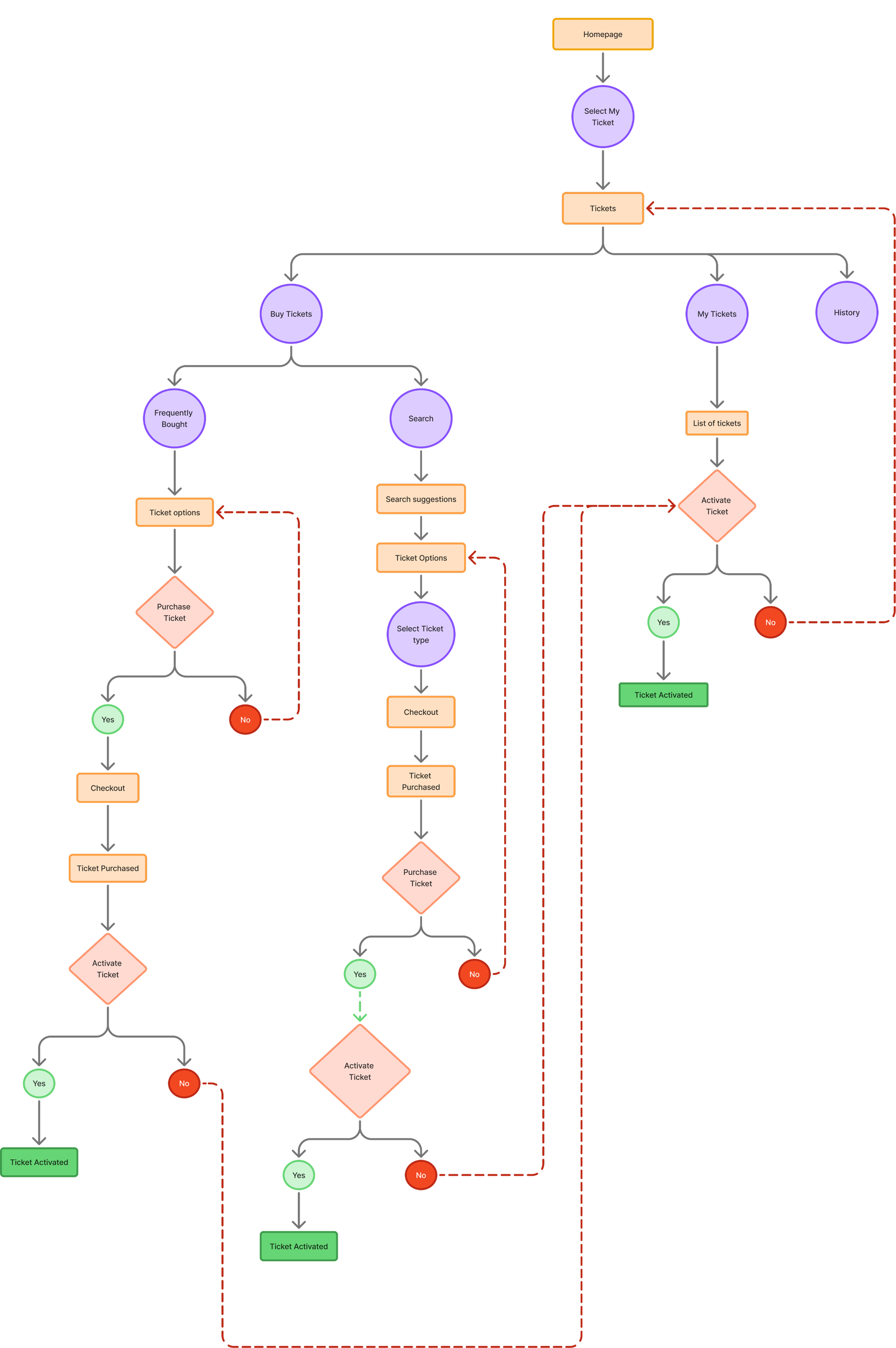
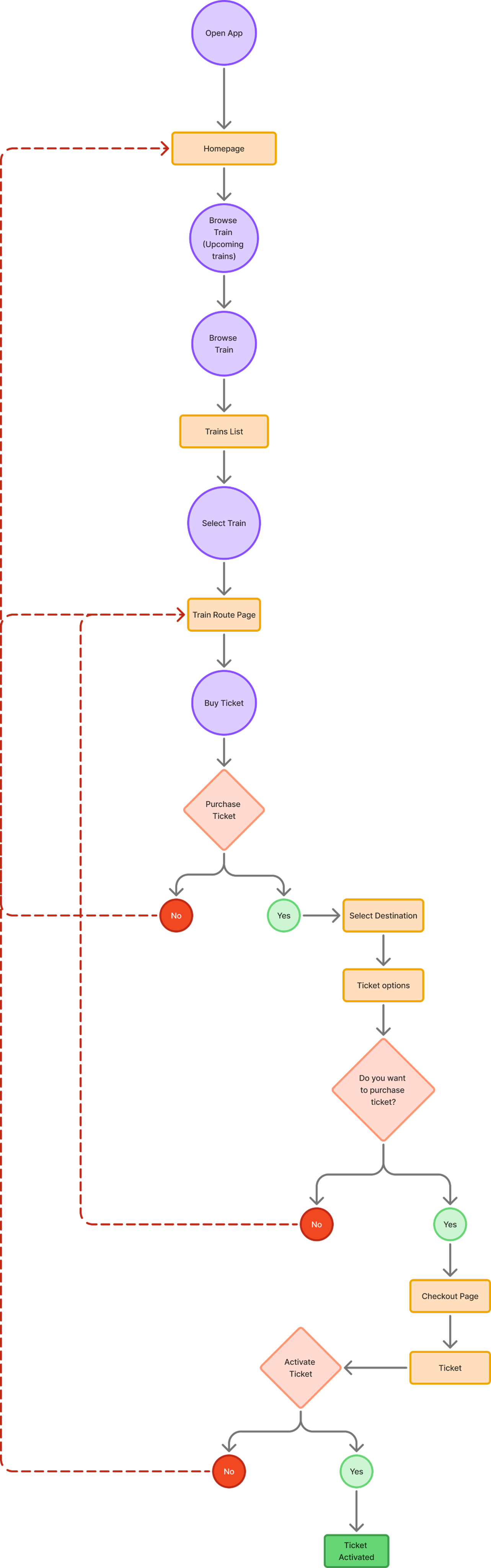
My Ticket Flow
Search Train Flow
Train Routes Flow
Wireframes
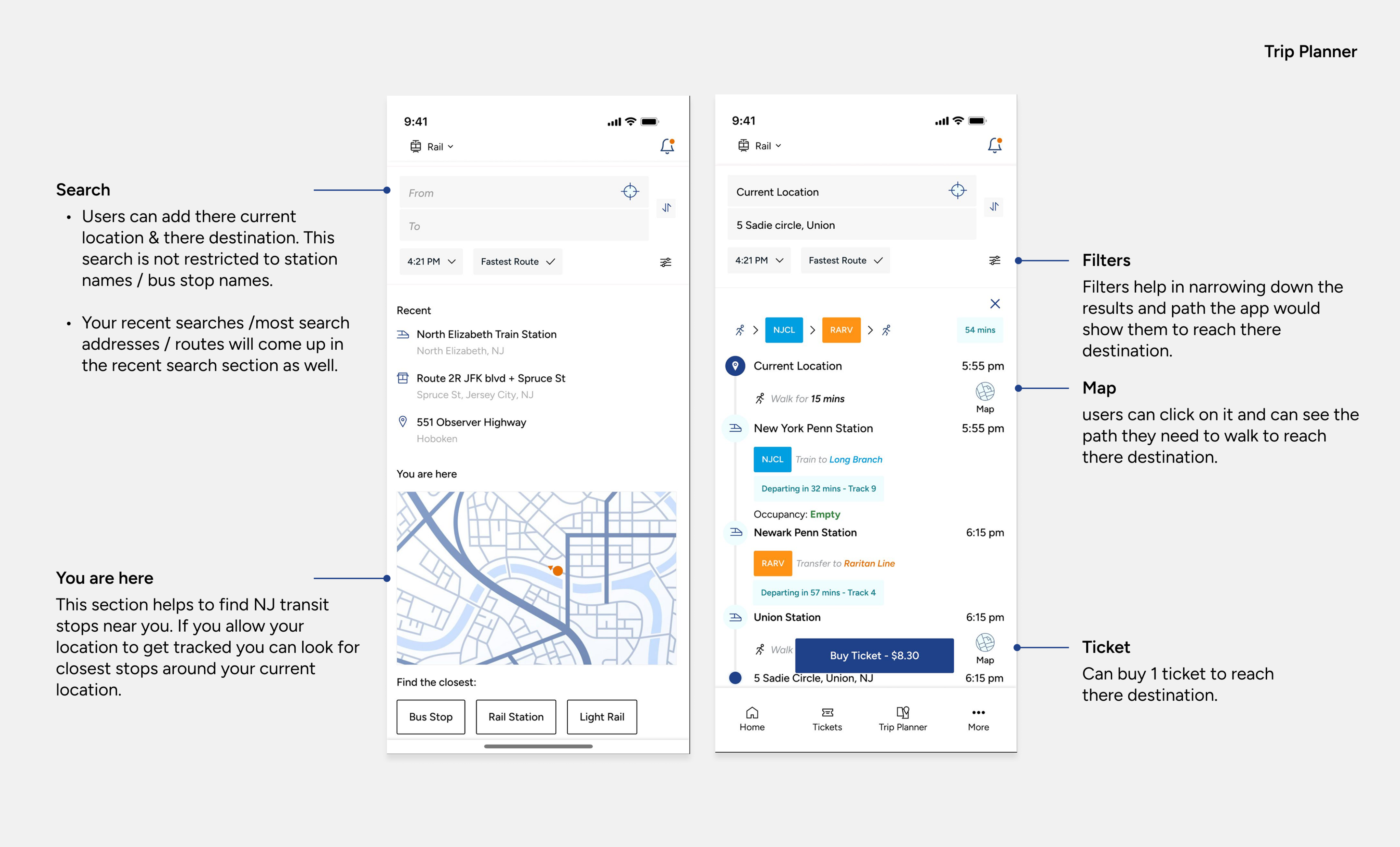
According to the User flow I created sketches & wireframes. After multiple alterations and testing multiple ideas the final wireframes were created. These wireframes acted as a base before design the final screens for the app.

Final Wireframes
According to the User flow I created sketches & wireframes. After multiple alterations and testing multiple ideas the final wireframes were created. These wireframes acted as a base before design the final screens for the app.
